Friday, April 22, 2011

Amanda Sussman Portrait Process

In 2010 I was asked to contribute 12 portraits to the TEDx Toronto Conference.  Being a big fan of the TED talks I was thrilled to accept.  This was the first portrait I worked on so it went through the most revision as I worked to establish the style.  Even so, the style shhifted a bit from one image to the next so each of these is similar but not the same in regards to the cartoony:realistic ratio.  I started with a quick doodle that looks very little like the actual Amanda Sussman.  I didn't even really study her photos for this one.  I wanted to see what impression my imagination would come up with.


Then another one using this great photo for reference... my drawing looks more like her now but still not quite.


Then build the vectors...


Then my wife Trina says "That's not very flattering for her" and I futilely try to argue that it is flattering until I inevitably cave and redo it to get the version below.


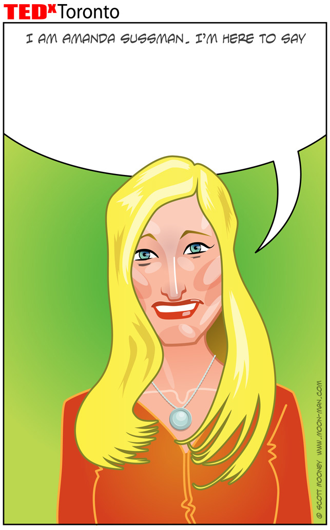
 ... Which is not the final version but now looking back I think it's the better one.  This image set the foundation to my approach to all the rest of the portraits, but in the end it was so different from all the rest I chose to completely redo the face and hair to blend in with the rest of the images.

So, another sketch and another vector rendering.


I usually make my characters up out of my imagination, which has it's own conventions, so it took a few tries to get the hang of quickly capturing the likenesses of real people.  The images got less and less cartoony as I worked my way through them.  By the end I had become very economical with my process and the likenesses got better and better, plus the final results started looking more and more refined.

Wednesday, April 20, 2011

Bike Boxes

This project was for the City of Guelph as part of it's traffic management experiment with bicycle boxes... a painted box on the road where cars allow bicycles to cross into the intersection for a left turn, or to wait at a red light with some breathing room.  All vector, no hand drawn elements.  Squeaky clean. Notice a bit of distorted perspective... I had to fit those traffic lights in and the road markings in this letterbox space.  This is why illustrated information design often works better than photography.  We're not limited by literal reality.