Tuesday, October 09, 2012

War of 1812 TV and Comics Illustrations

This summer I got to work on a historical TV program and related comics about the War of 1812 (in which America attempted to invade Canada). My client for this is Zeros2Heroes, a comics and entertainment company out of Vancouver. There were 6 episodes in total (of which I illustrated 3) and each episode was also turned into a 22 page comic book (of which I illustrated 2).  I was hired on as a penciller, so the inks and colours and lettering were designed by other artists.  These are some samples of those pencils.

These TV bits are from the episodes about Sir Isaac Brock and Laura Secord.


These comics pages are from the story of Enos Collins, the privateer that helped win the war, got rich in the process and founded a bank now known as the CIBC, which is one of the biggest banks in the world right now.


Thursday, September 27, 2012

Mighty Bubble Issue 3

My latest Mighty Bubble minicomic.  I went for a retro 3 colour treatment on the cover because it looks cool and sophisticated, and to save time… it’s actually a really efficient way to colour something.  Lazy or efficient?  You be the judge.

Mighty Bubble is a character I created (in collaboration with the communications team at AECOM) for Hudbay Inc. as a part of their corporate citizenship with Flinflon Manitoba/Saskatchewan (the town straddles the border).  Mighty Bubble is part of an ongoing campaign to get kids excited about hand washing. Fun things I’ve created for the campaign include Mighty Bubble himself and his accompanying characters, stickers, puzzles, activity sheets, temporary tattoos, and of course the comics, written and drawn by yours truly.  It’s a really fun and creative program to be a part of.  I really want the program to grow from Flinflon to the rest of the world.  It's a great public message with huge potential to improve public health, and the kids are loving it.


Tuesday, May 29, 2012

Canadian History Doodle

Here's a little character study for a period piece I'm working on for an entertainment company.  And that may be about all I'm legally allowed to say right now.  But I thought it was a nice image and this will likely be the only place anyone will ever see it.  It's a doodle I made in the margin of the script to help me get a sense of the character.  The final product ended up being something quite different than this.  


Saturday, April 07, 2012

She Hulk and Hellboy Get It On Again

Scroll back a couple of years or so in this blog and you'll see that this is a sequel to an older bit of fan art.  I love seeing Hellboy and Shulkie together.  I think they make a good pair.  Could be a great crossover comic.  Differing in personality, similar in temper and braun.  Lots of super powered chemistry and conflict potential.


Friday, December 23, 2011

Parting Ways Meets Done to Death

Here's my little tribute to Andrew Foley, writer of Parting Ways (which I illustrated with Nick Craine) and Done to Death (illustrated by Fiona Staples).  Find these comics at your local comics shop!  Also, Parting Ways is available as a digital comic at www.graphic.ly.


Saturday, December 03, 2011

Young Ellen

I drew this one tonight... falling in love with Sketchbook Pro.  Great little drawing program!


Friday, December 02, 2011

Concept Art Fantasy

Every now and then I mess around with some bit of software to see if I can use it practically for illustration.  I love concept art and character design, but most of my professional work revolves around technical, medical and otherwise instructional art so I don't get paid to do a lot of this looser more imaginative kind of work... yet.  I guess you gotta get it out there if you want people to hire you for it, so here's a selection of concept drawings and character designs from the ol' digital doodle folder.  


Wednesday, September 14, 2011

Manga Studio

Smith Micro had their Manga Studio comics creation software on sale recently.  Something I've wanted to try for a long time.  Turns out it's a really nice drawing tool.  It's exactly the thing to have if you like drawing comics.  Here's one of my doodles from that tool...  The inking tool creates just the kind of line work I love.

Friday, August 12, 2011

Dog Heart 2

This is the second time Dogs in Canada Magazine asked me to make a picture of a dog's heart.  Several years ago I did one as a cutaway to show how the blood flows through.  This time I wanted to make it squeaky clean with a purely vector constructed image... which I've been doing a lot of lately.  I really love how clean these come out.  It makes all the tedious construction time worth the effort. 


Drink an' Draw Doodles

I don't make it out to every Drink an' Draw event but this summer I made it twice so far and here are a few doodles I made.  Last time I brought my Modbook, determined to make a digital painting on it.  That's what Bought the machine for after all, but usually I just use it the same old way I used my ordinary desktop.

1972 Man, directly in brush and ink.


Hellboy done in Artrage on my Modbook

Ratchet and Clank Doodle

Sunday, July 31, 2011

Mighty Bubble!

This work is part of a major hand washing awareness program designed to get kids feeling great about washing their hands.  Soap is your super power against germs!  The campaign includes stickers, temporary tattoos, activity sheets with games and colouring and drawing, a costumed mascot that visits schools and events, and a series of comics.  The tag line "Soap is your superpower!" and the comics were my idea as a way to get a story to live in the minds of the kids, so that they can imagine themselves vanquishing the germ bad guys by washing their hands just like Mighty Bubble does.

This project is a community service initiative by AECOM on behalf of HudBay Minerals.
All images are copyrighted by HudBay Minerals.

Check it out at www.mightybubble.com.


Friday, June 24, 2011

SuperGiants

Here's a special one I haven't shown before.  This was published this year in UpHere Business Magazine, based in Yellowknife NWT.  It's for an article about some previously inaccessible super giant mineral deposits that are soon to be accessible.  The client started me off with an idea sort of like the Superfriends TV show, with three caped superheroes charging towards the "camera".  But as I started drawing that it occurred to me to do something more elemental, so I sketched it out and pitched the idea of humongous giants towering over the Northern Landscape.  They loved the idea so we went with it.  From front to back we have giants representing rare earth minerals, iron ore, and a mysterious deposit that is yet to be determined what it is.

Thursday, June 02, 2011

Logo Evolution, Trina Koster Photography

The Trina Koster Photography logo has been updated a few times. I've always loved the dynamic moody, imaginative art of comics, fantasy art, and concept art and I'm committed to bringing that dynamic aesthetic into everything I possibly can.  So here's the latest version:


Below was my first proposal for the 2011 version, but Trina thought it was way to... uh... buxom for her comfort level, and she wanted the sort of symbolic faces to be more specifically similar to her own face.  I didn't mean for the figures to literally be Trina, but more a comic-booky symbol of dynamic girl power in action.


It evolved from this one, which at the time I made it I thought it was pretty cool, back in 2006 or so.  But now it looks like the figures are slouchy and... uh... boring compared to the one above. Also, I needed to update the cameras... When's the last time you saw a big medium format film camera at a wedding?


The one immediately above evolved from the one below, which I created circa 2000... pretty clunky looking, right?  Well, we all gotta start somewhere.  :-)


Monday, May 30, 2011

Vector Self Portrait Avatar


I figured I should make my profile picture and avatar an illustrated image of my own face, rather than a photo... This way I'm advertising my wares when I participate in on-line discussion groups.  So here's what I came up with.

Sunday, May 22, 2011

Portrait In Vectors

Here's the rest of that portrait I showed you in my last post.  Click the image for a larger view.


Here are my initial sketches.


This is a private commission so I worked very closely with the client to make sure I captured the essence of his loved ones as he sees them.  You can see that there were a few tweaks to the attire and especially the little boy's face shape.  What a great experience!  Shout out to my client...  Thanks for the great project, Jair!

Friday, May 20, 2011

What's the Value of Art?

Someone in a linkedin discussion asked what is the value of making art other than making money.  This got me thinking and I responded with this:
Aside from making money, the value of art is in developing and sharing ideas and emotions.  The medium helps dictate the sort of thought and emotion that can be explored, so the medium itself helps develop new ways of thinking of things.  And this is valuable because it's important to grow and learn and broaden our perspective to make us more savvy decision makers and action takers.
For instance, drawing in vectors makes me think differently than drawing in brush and ink.  I become more methodical and analytical.  Drawing in brush and ink is more intuitive and immediate.  This vector portrait I just made actually comes out looking more soft and natural looking than my ink drawings do, even though the vector image is made completely of hard edge shapes and my ink drawings are made of organic hand made brush strokes.  How ironic!

Friday, April 22, 2011

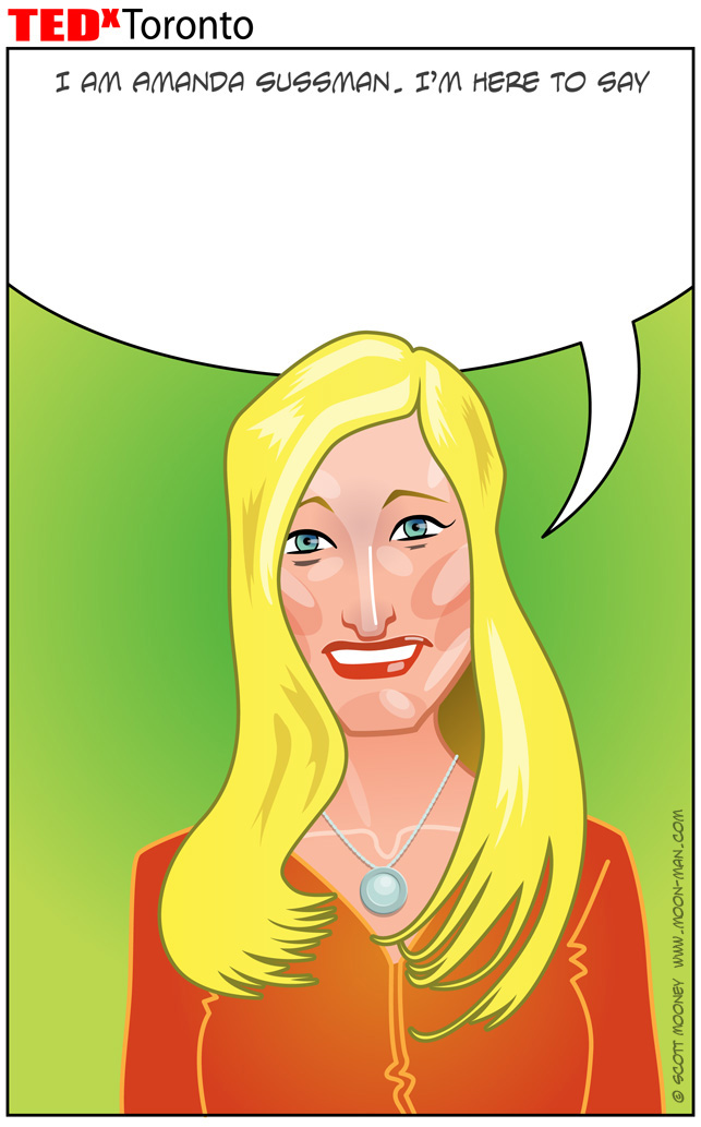
Amanda Sussman Portrait Process

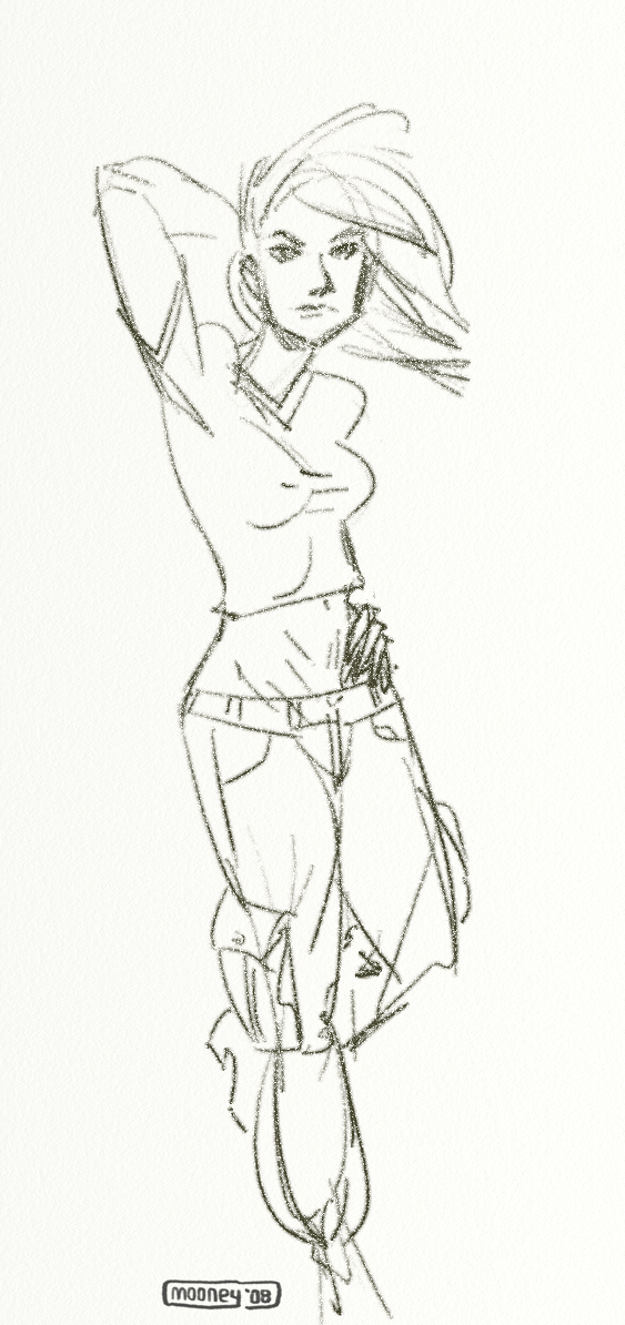
In 2010 I was asked to contribute 12 portraits to the TEDx Toronto Conference.  Being a big fan of the TED talks I was thrilled to accept.  This was the first portrait I worked on so it went through the most revision as I worked to establish the style.  Even so, the style shhifted a bit from one image to the next so each of these is similar but not the same in regards to the cartoony:realistic ratio.  I started with a quick doodle that looks very little like the actual Amanda Sussman.  I didn't even really study her photos for this one.  I wanted to see what impression my imagination would come up with.


Then another one using this great photo for reference... my drawing looks more like her now but still not quite.


Then build the vectors...


Then my wife Trina says "That's not very flattering for her" and I futilely try to argue that it is flattering until I inevitably cave and redo it to get the version below.


 ... Which is not the final version but now looking back I think it's the better one.  This image set the foundation to my approach to all the rest of the portraits, but in the end it was so different from all the rest I chose to completely redo the face and hair to blend in with the rest of the images.

So, another sketch and another vector rendering.


I usually make my characters up out of my imagination, which has it's own conventions, so it took a few tries to get the hang of quickly capturing the likenesses of real people.  The images got less and less cartoony as I worked my way through them.  By the end I had become very economical with my process and the likenesses got better and better, plus the final results started looking more and more refined.